
While shades like phthalo green or chromium oxide are known for their intensity, cobalt green offers subtlety and stability, allowing painters to create nuanced foliage, atmospheric effects and natural-looking shadows.
Origins of cobalt green
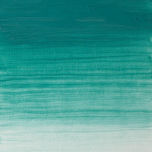
Cobalt green was first developed in 1780 by the Swedish chemist Sven Rinman, who created the pigment by combining cobalt and zinc oxides. Although it became commercially available from 1835, it was not widely used until after 1860, when zinc oxide became more readily obtainable. The chemist and amateur painter Arthur Church highlighted cobalt green in his 1901 book The Chemistry of Paints and Painting, praising it as “chemically and artistically perfect.” The pigment dries quickly in oil and produces delicate granulation in watercolour. These qualities made it especially appealing to artists looking for a stable, semi-transparent bluish-green that would not fade.
Examples of cobalt green in popular culture
While genuine cobalt green pigment is mainly used in fine art, its distinctive bluish-green tones continue to influence film, television and design.
Alfred Hitchcock’s Vertigo (1958) regularly features a similar shade of green in its costumes, props and lighting, linking the colour to obsession, danger and the supernatural.
The Matrix (1999) uses a cool green tint throughout its simulated world, giving scenes an artificial atmosphere that reinforces the sense of being inside a computer program.
More recently, the Apple TV+ series Severance (2022) uses cobalt green-like tones to create a sterile, unsettling atmosphere, reflecting the show’s themes of control and separation between work and personal life.
In video games, cobalt green-like tones add realism to immersive worlds and environments. In Hollow Knight (2017), deep greens appear in mossy caverns and glowing fungal landscapes, helping to establish a mysterious and otherworldly mood while guiding player interaction.
How artists use cobalt green
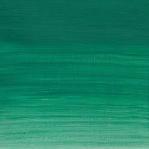
Cobalt green’s cool, bluish-green tone and semi-transparent quality make it a versatile choice for artists of all kinds.
Winslow Homer used cobalt green-like shades to depict water with subtlety and naturalism, showing how the colour can build atmosphere without overpowering surrounding tones. In Breezing Up (A Fair Wind) (1876), the artist used soft bluish-green tones to create a realistic sense of movement, texture and depth.
Pablo Picasso employed similar shades in works such as Green Still Life (1912). The muted green surfaces in this Cubist composition provide structure and contrast, demonstrating how the colour can make complex, abstract arrangements feel cohesive and balanced.
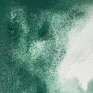
Contemporary watercolourist Yuko Nagayama frequently uses bluish greens for botanical and floral studies. Her layered washes create luminous leaves and stems while preserving vibrancy and delicacy.
